有别设计 丨你捞我烫,再现江湖
有別設計
D+space design
研究型設計
商鋪設計
商業展示空間設計
創意酒店設計
精品餐廳設計
藝術展示空間
空間應用平面設計
email: dillon1713@126.com
contact: +86 0512-6874620
ad: 蘇州園區 通園路80號 56文創園
------------------------------------------------------------------------------------------------------
红颜弹指老
刹那芳华
与其天涯思君
念念不忘
不如江湖再见
你来捞,我来烫

设计概念:
这是餐饮行业的黄金时代,风起云涌,百家争鸣。在如此强劲的竞争下,苏州漫妮餐饮集团旗下的轻餐品牌你捞我烫在全国铺设百余家店面后,根据市场需求全线升级。苏州有别设计在接到这个案子的时候,并没有开始着手于做设计,而是开始客群调研和大数据分析。你捞我烫的现有门店大多是CBD区域的商场中和邻里中心的大型超市旁。8090后的白领阶层居多,对这类群体来说他们更多关注的是食材的新鲜,配料的考究,以及环境的舒适度和氛围中的情感关怀。那么有别设计把受众对于生活中高品质的需求以最直白的方式呈现出来,传达出你捞我烫的餐饮哲学。
This is the golden age of food and beverage industry. The competition is fierce and all schools of thoughts contend for attention. Under such a strong competition, after having set up more than 100 stores, the light food brand Li Lao Wo Tang owned by Suzhou marvel restaurant group upgrade itself based on market demand. After having received this case, Instead of working on the design Su Zhou You Bie She Ji started to study the customer groups and analyze the data. Most of the stores of li Lao Wo Tang are in the Shopping mall of CBD zones and near the supermarket of Lin Li Zhong Xin. Most of the customers are white-collar workers born after 1980s and 1990s. Such groups are more concerned with the freshness of ingredients, and the ingredients, the comfort of the environment and the emotional warmth of the atmosphere. So, You Bie She Ji shows the audiences’ high quality requirement about life in the most straightforward way, which conveys the philosophy of Ni Lao Wo Tang.
平面图.png")
在平面布局中,从左边起依次开始取盘和餐夹到冷柜前选择食材,最后在吧台结账拿号码牌,动线合理流畅,即使在午间用餐的高峰期也会自然形成队伍,有条不紊。就餐区设置了卡座,可拼合的散座和吧台区域,完全满足不同数量和情感需求的食客。
Plane layout: From left to right, we can see the zone for customers to take plate, and then is the food materials zone and then the checkout counter, at which customers can pay their bill and get the number cards. The design is reasonable and smooth, and even during the peak lunchtime; it will naturally form a team and be methodical. The dining area is equipped with a seat, a split seat and a bar area to cater for many customers quantities and their emotional needs.


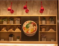
当走进商场入口后的第一个视线焦点便是不远处红色纱幔和竹质吊灯,门头矩阵式的格栅让中间的Logo格外显眼,天然原木色的定制家具和墙面散发出自然温暖的色调及质地,水泥砖和灰色调花砖拼贴即划分出区域的功能性又增加了空间的层次感。
When entering the entrance of the mall, the first things that catch your eyes are the red gauze and bamboo chandeliers. The grating makes the middle Logo stand out. That custom furniture made of natural wood and the walls give off a natural warm tone and texture and the function that cement brick and grey mix tile can compartmentalize different zones increase the layer sense of space.
------------------------------------------------------------------------------------------------------
右半边区域:
在这个区域中,能明显的感到你捞我烫背后的理念是希望食客在一个不同往常的场景中来食用一碗新鲜,考究的麻辣料理。因此设计师用了红色纱幔烘托出整个空间的氛围感。竹子的吊灯突出了中式餐饮的属性。右半边设置了半包围的卡座,多人的散座和单人的吧台,照顾到每一个人,这是你捞我烫与食客间传递的温暖,让情感不只限制在食物中,而是在视觉,味觉,嗅觉,感觉,听觉中肆意流动。
In this area, we can feel easily that the idea behind Ni Lao Wo Tang is to make diners eat a bowl of fresh, particular spicy food in a different zones. So stylist uses red gauze mantle to foil the atmosphere of the whole space. The bamboo chandelier highlights the attributes of Chinese dining. There are semi-enclosed seat and single seats and bars for single people, which take care of everyone. This is the warmth transmitted between the diners, which let the emotions not only be in the food, but in the sight, taste, smell, feeling, and the sense of hearing.


中间区域:
设计师有心在餐厅的中间位置加重笔墨,设计了一个轴对称式的卡座场景,将红纱曼和竹灯贯穿到底,让人不禁觉得在这样的卡座里等人都是一件浪漫的事情。
The designer paid a lot of attention on the center of the restaurant. He designed a axisymmetric cardholder scene, which makes the red mantle and bamboo lamps through the end, which makes people can’t help but think to think that waiting for someone in such a booth is a romantic thing.


左边区域:
选材区域,顶部灯箱的设计即不会有因为降低了吊顶而感到的压抑感,文字内容在第一时间传递出食材的新鲜。冷冻柜的顶层整齐的摆放了仿真蔬菜框,从视觉上丰富了食材多样性。
Food material selecting area: The design of lowering the light box on ceiling will not depress customers. Text content delivers the fresh ingredients in the first time. The top of the freezer is laid out of the simulated vegetable frame neatly, which enriches the diversity of food materials visually.


细部节点:

餐桌椅均是为本项目设计定制的原木家具,搭配健康的亚麻色布面坐垫。让食客在舒适的环境中用餐。
Dining tables and chairs are custom raw wood furniture designed for this project Pair with a healthy linen cloth cushion is able to let diners eat in a comfortable environment.


一般多数的餐厅会更多的把注意力放在他们提供的食物上,但设计师认为这虽然是很重要但是在餐厅里所传递出的信息同样重要,随处可见的Q版食物的形象画和暖心标语,让食客更了解他们吃的食物的来源及特性,达到看的舒心吃的放心。
Most restaurants tend to focus more on the food they provide, but the designer think this is important but the information that is conveyed in the restaurant is equally important.
The image of the cute food and the warm heart slogan give diners a better understanding of the origins and characteristics of the food they eat, which makes the customers happy to see and comfortable to eat.


黑白线条拼接的半隔断和同样元素的调味罐将一个中式气质的餐厅融入了轻时尚的气氛,使得整个空间多了一丝诙谐,通过这样的小细节让食客不经意中莞尔一笑,向一个集合食物,态度,方式的餐饮空间过渡,希望这里能聚集一群同样生活方式的群体在这个餐厅里一起吃着美食一起开怀大笑!
The Half partition combined with black and the sauce pot filled with the same element put a dining-room with Chinese style into the atmosphere of light vogue, which makes the space a little bit more humorous. We hope these small details make the diners smile and the diners can get used to the dining space combined with foods, attitude and manner. We hope a group of people living in the same way can gather together to eat together and laugh together in this restaurant.
项目名称:你捞我烫
项目地址:江苏南通
项目面积:80平方米
设计公司:有別設計
摄影:有別設計
建成时间:2017.12
有別設計簡介
由邓巍先生和吴京芷女士于2016年初共同创立的有别建筑空间设计公司,是一家立足于中国苏州,辐射东南亚的多元化的研究型商业空间设计公司。提供从平面到空间的全套设计服务,充满革命色彩,挑战常规的设计。拥有来自北上广深等境外事务所工作经验的员工们,不同的文化背景组成的有别团队,以区别化,情感表达和商业效益的设计理念创造一个新的商业空间设计哲学