原一空间设计:JIAYI柔版科技展厅
“极简不仅仅是简单,它是对精益求精,并使复杂之物简明扼要。 ”
——约翰·梅达。
"Minimalism isn't just about simplicity, it's about refinement and making the complex simple."
—— John Maida.
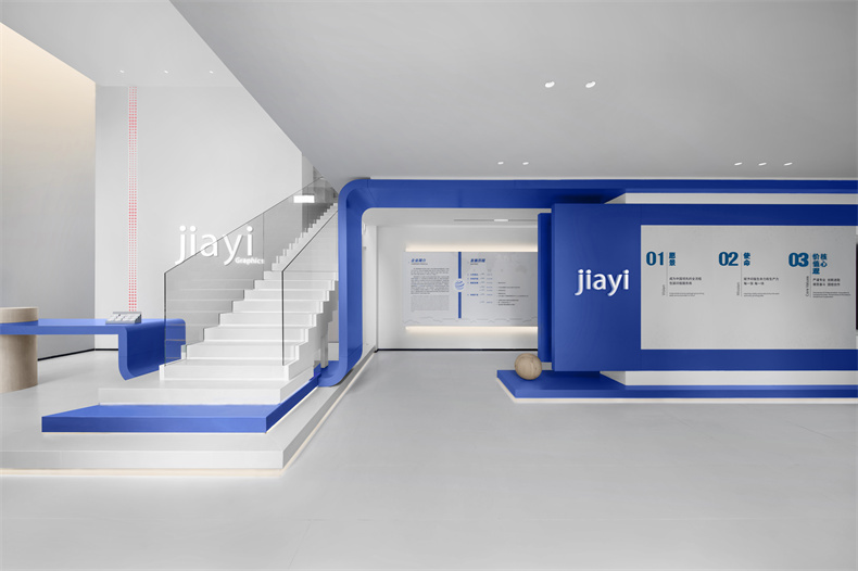
▼跳动的蓝色音符,Beating blue notes ©Little Xie

每个空间的辐射半径是有限的,那如何在有限的空间中展现出主题的内容,我们需要找寻在空间的视觉中心,并且在视觉中心中衍生交互展示的概念拓展。这次我们收到的委托命题,基于企业需求,我们决定用蓝色来阐述这个空间。用颜色来阐述企业的辨识度,以简约的设计体块去表达空间为企业展厅赋予全新的生命力。
The radiation radius of each space is limited, so how to display the theme content in a limited space, we need to find the visual center of the space, and derive the concept of interactive display in the visual center. Based on the commissioned proposition we received this time, based on the needs of the enterprise, we decided to use blue to illustrate this space. Use color to illustrate the identity of the company, and use simple design blocks to express the space, giving new vitality to the corporate exhibition hall.
▼一层空间概览,First floor space overview ©Little Xie

PART01
跳动的蓝色音符
Beating blue notes
在尊重原有建筑的结构基础上,如何处理入口处空间高差,赋予空间新的生命,成为一个急需要解决的问题。
在这一空间框架下,我们尝试通过体块的连接将视觉延展,空间在轴线上被无限放大。入口处的高挑空间与内部空间的深度相呼应,蓝色线条如同活泼的音符,从入口跃起,流畅地穿梭在空间中,赋予空间灵动的气息。
On the basis of respecting the structure of the original building, how to deal with the spatial height difference at the entrance and give the space new life has become an urgent problem that needs to be solved.
Under this spatial framework, we try to extend the vision through the connection of volumes, so that the space is infinitely enlarged on the axis. The high space at the entrance echoes the depth of the interior space. The blue lines are like lively notes, leaping from the entrance and flowing smoothly through the space, giving the space a lively atmosphere.
▼蓝色线条在空间中不断延伸,Blue lines continue to extend in space ©Little Xie

木色的柱体犹如休止符,作为空间的起始界定了视觉情绪的不同表达,并以此蜿蜒而出,
流向内部的空间。
The wood-colored columns are like rests. As the beginning of the space, they define different expressions of visual emotions, and then wind out,Flow to the interior space.
▼人在空间的行走路线,People’s walking route in space ©Xuzhihui

▼从展厅回望楼梯,look back at the staircase from the exhibition hall ©Little Xie

▼首层展厅,Exhibition hall on the first floor ©Little Xie

利用体块与颜色营造出空间的深邃延展,原先的绵长空间,经由蓝色线条的穿梭与连接,得以完美融合。
材料的运用上,我们希望和色彩保持“克制”,但它也应该符合品牌与当下时代的特点,因此我们将用一些更具未来感、更质感的材料。
The use of volume and color creates a deep extension of the space. The original long space is perfectly integrated through the shuttle and connection of blue lines.
In the use of materials, we hope to maintain "restraint" in terms of color and color, but it should also be in line with the characteristics of the brand and the current era, so we will use some materials that are more futuristic and textured.
▼展陈+互动一体空间,Exhibition + rest integrated space ©Little Xie

互动区域布局中,体块间不断重组,使其在小范围空间内尽量多的体现出其功能多样化。
In the layout of the interactive area, the blocks are constantly reorganized to reflect as many functional diversities as possible in a small space.
▼轻巧的空间分割方式,Lightweight space division method ©Little Xie


开放而有趣的路径设置,灵活的分割和衔接空间,增加空间节奏感,保持一定私密与通透,自然过渡衔接到不同区域。
Open and interesting path settings, flexible division and connection of spaces, increase the sense of spatial rhythm, maintain a certain degree of privacy and transparency, and naturally transition to different areas.
▼展厅内设置座位区,Seating area in the exhibition hall ©Little Xie


▼悬浮在空间中的蓝色丝带,Blue ribbon suspended in space ©Little Xie

以蓝色为空间主基调,结合造型体块与灯带融合呈线性光源。在浅色空间氛围中,其形态悬浮于空间之中,为整体空间带来了流动的美感。
With blue as the main tone of the space, the modeling blocks and light strips are integrated to form a linear light source. In the light-colored space atmosphere, its form is suspended in the space, bringing a flowing beauty to the overall space.
▼一层大厅的阶梯,将通往二层展区,
The stairs in the hall on the first floor will lead to the exhibition area on the second floor ©Little Xie

PART02
乐章的流转与和谐
The flow of music and harmony
空间是为产品服务的,在设计空间时,如何为为观者提供一个既高效又富有情感的体验,是我们设计考量的重点因素。
裸筑曾提出过:美来源于秩序中的惊鸿一瞥。面对丰富的产品物料,我们决定以有条不紊的展示手法进行阐述,将空间雕琢为“回”字形结构,三面墙身设置展示壁龛,缓缓展开公司产品的发展史书卷。
Space serves products. When designing space, how to provide viewers with an efficient and emotional experience is a key factor in our design considerations.
Naked Architecture once proposed that beauty comes from the glimpse of order. Faced with a wealth of product materials, we decided to use a methodical display method to elaborate, carving the space into a "back"-shaped structure, and setting up display niches on three walls to slowly unfold the development history of the company's products.
▼模块化的展台,Modular booth ©Little Xie


跳动的旋律还在继续,以线作面,以面作体,构成了空间中不同层次和角度的视觉效果。蓝色的体块与空间的互动营造出持续而反复的感受。自然光影随时间变幻,为空间流动着迷人的底色,融合空间结构、尺度和色彩,令空间呈现出多元而富有创意的可能性。
The beating melody continues, using lines as surfaces and surfaces as bodies, forming visual effects at different levels and angles in the space. The interaction between the blue volume and the space creates a continuous and repeated feeling. Natural light and shadow change over time, giving the space a charming background. The integration of spatial structure, scale and color makes the space present diverse and creative possibilities.
▼蓝色的体块在空间的延续,The continuation of the blue volume in the space ©Little Xie

▼可旋转展架,Rotating display stand ©Little Xie

可旋转的展架,在转动的同时带来光影的变幻,丰富了几何线面构成的空间美感。
The rotatable display rack brings about changes in light and shadow while rotating, enriching the spatial beauty composed of geometric lines and surfaces.
▼陈列区,Exhibition area ©Little Xie

一字排开的陈列方式呈现出缓缓的节奏感,犹如音乐的几个乐章,段落之间有停歇和连续,又能被共时串联成一体,成为一种连绵的语言性建构。
The row-by-line display presents a slow rhythm, like several movements of music. There are pauses and continuity between the paragraphs, and they can be connected together simultaneously, becoming a continuous linguistic construction.
▼展厅细部,Showroom details ©Little Xie

▼嵌入墙体的壁龛,alcove built into the wall ©Little Xie


▼一层平面图,First floor plan ©Xuzhihui

▼二层平面图,Second floor plan ©Xuzhihui

项目名称:JIAYI柔版展厅
项目地点:浙江嘉善
项目面积:638.7㎡
完工时间:2023/09
设计团队:陈一夫/张原/郭强/徐志慧
设计公司:原一空间设计
摄影:小谢氏
Project Name: JIAYI Flexo Exhibition Hall
Location: Jiashan, Zhejiang
Area: 638.7㎡
Project Year: 2023/09
Designers: Chenyifu/Zhangyuan/Guoqiang/Xuzhihui
Photographer: Little Xie

设计腕儿官方微信
010-88600030
-
原一空间设计:JIAYI柔版科...
-

原一空间设计:YEE逸舍瑜伽